Data Visualization: Student Loan Default Rates By Institution
This is Jamie Martin writing once again about a new data visualization I’ve been working on. If you didn’t see my basketball ranking data visualization a few weeks ago, you should check it out as well.
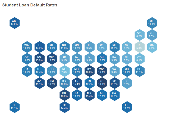
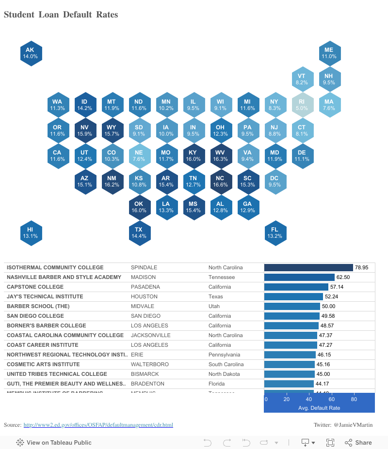
My latest visualization helps answer the question posed by a higher education professional — Are there specific parts of the country and specific institutions that are feeling the biggest burden of student loan debt?
I didn’t know the answer immediately, but knew that web data paired with visualization could answer the question. For the data source, I turned to the Federal Student Aid Cohort Default Rate Database and used Tableau to quickly visualize it by state and institution.
The following visualization helps answer the question and shows which institutions are failing their students on preparing to fulfill their accumulated debt. Click a state to filter in on specific institutions within that state. It’s also important to note that I calculated the average student loan debt by aggregating students and not averaging percentages.
Using Web Data
This is all data that is freely available on the web to be harvested. The data used to feed this visualization was data provided by the federal government. We specialize in harvesting and organizing web data through our Data-as-a-Service.
If you are interested in learning more about our Data-as-a-Service, get more information here.
Feel free to check out another visualization focused on politics that uses data from our Global News Data Feed here.
//


