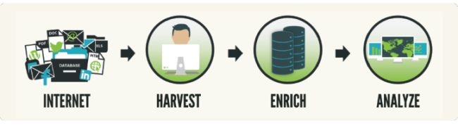
How Data Goes from Deep Web to Analysis – The BrightPlanet Process
Being in the business of collecting and enriching data from the web, much of the emphasis is focused on either the collection of the content or the enrichment of the content. The actual value; however, is when you are able to create a story from the whole process: harvesting, enriching, and analyzing. In today’s posting, we’ll tell a whole story using data harvested from April 28, 2014.

Harvesting: The Data
The first step in the BrightPlanet process is harvesting the actual data. For today’s blog posting we are going to skip how we harvest, and focus on what we have harvested already. If you to learn more about our harvesting capability, jump over to our previous blog post on harvesting.
The data that we are going to take a look at to understand the process is a one day snapshot of data harvested from our Big Industry Threats Silo or BITS dataset. The BITS silo contains data continuously harvested from over 8,000 national and international news sources in multiple languages. During the one day, April 28, 2014, over 61,647 different articles from the 8,000 sources were harvested and collected into the BITS silo.
The Enrichment
After the data is collected, we go through our enrichment phase where we extract entities. On April 28,2014, we harvested the 61,647 articles and tagged over 2.2 million different entities within the documents. That’s all just for one day worth of data!
To make enrichment easier to understand, for today’s analysis, let’s focus on one individual entity – our person entity. With our entity extraction partner, Rosoka, we have over 50 unique entity types that we tag for documents, including the names of people.
From the over 61,000 documents we harvested into the BITS silo on April, 28, 2014, we extracted a total of 633,000 names of people and 95,000 of those names were unique. Now that you have a good understanding of the dataset, let’s take a look at some of our findings.
Our Analysis
Let’s begin by getting into some of the enriched data and how it appears. To help us visualize the dataset, we turned to the dashboard tool Tabelau for a couple visualizations
Let’s first take a look at the data by uncovering whose most mentioned as a whole. The following visual displays from the 61,000 harvested articles on April 28, 2014, who was mentioned most often.
We find that not surprisingly the name mentioned most often in the media that day was United States President Barack Obama. On that same day he was almost surpassed by Late Late Show Host Craig Ferguson, who announced his intended talk show departure on April 28. Following the talk show host is Donald Sterling, whose recent media frenzy began on April 26 when TMZ and Deadspin both released recorded conversations of controversial statements by the Los Angeles Clippers owner.
The next visual we’ll let you play around with this next visualization yourself and deduce your own findings. We break down the data and allow you to filter and further visualize by domain. We included some of the top U.S. and world news sources so you can see who their most common reported person was for April, 28, 2014, by domain.
Putting all the pieces together
In today’s posting, we examined only one entity from one day to help give you an understanding of the power of the BrightPlanet process of harvesting, enriching and analysis. Now imagine when you put all the pieces together what is possible combining the over 50 entity types tagged in every document with days, weeks, months, and years.
Want to learn more about what is possible with Data-as-a-Service from BrightPlanet? Request a demo from a Data Acquisition Engineer.

//