DATA VISUALIZATION: Uncovering Insights from Election Coverage
How often are the presidential candidates being mentioned in the news? And who’s mentioning them? Two questions we asked ourselves at BrightPlanet recently.
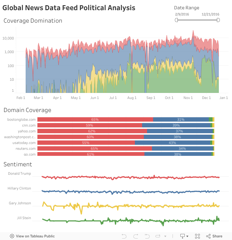
Fortunately for us, we already had the data in our Global News Data Feed to help answer those questions. Using the Global News Data Feed, we created the following visualization via Tableau to help answer these questions, and also allow you to uncover additional findings through data visualization.
The graph features an overall mention chart, the break down of each candidate’s mentions with a domain, and finally the overall polarity of each candidate by day.
Some interesting trends, we are already seeing: Donald Trump gets mentioned….a lot!
1 – Donald Trump gets mentioned….a lot. He receives over 61% of mentions compared to Hillary’s 25% and Bernie’s 13%.
2 – Hillary winning the nomination not surprisingly has hurt Bernie’s press coverage.
Take a look at the visualization below and let us know your own findings!
var divElement = document.getElementById(‘viz1483997950883’); var vizElement = divElement.getElementsByTagName(‘object’)[0]; vizElement.style.width=’804px’;vizElement.style.height=’869px’; var scriptElement = document.createElement(‘script’); scriptElement.src = ‘https://public.tableau.com/javascripts/api/viz_v1.js’; vizElement.parentNode.insertBefore(scriptElement, vizElement);
Develop Insights For Your Business With a Free Consultation
Learn more about how web data can be curated and visualized to develop insights for your business by scheduling a consultation with a Data Acquisition Engineer.

//